Gracie Barra Wear
Instilling GB Wear's brand values into a digital experience, and creating an efficient UX for complex custom orders.
About GB Wear
As a leader in Brazilian Jiu-Jitsu, Gracie Barra knows what it takes to live and breathe martial arts. Through GB Wear, Gracie Barra creates apparel by and for practitioners across the globe whether training in traditional uniforms or showing off their passion outside of class.
Project Brief
In our discussions with the client, we identified these three goals for the project -
1
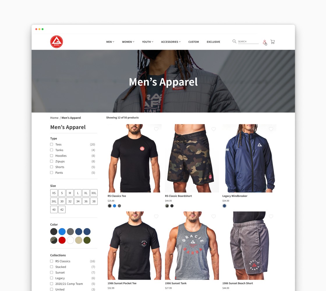
Create a refreshed digital brand that feels separate but aligned with the greater Gracie Barra organization.
2
Define an accessible, minimal user interface that is welcoming to students and customers of all ages and abilities
3
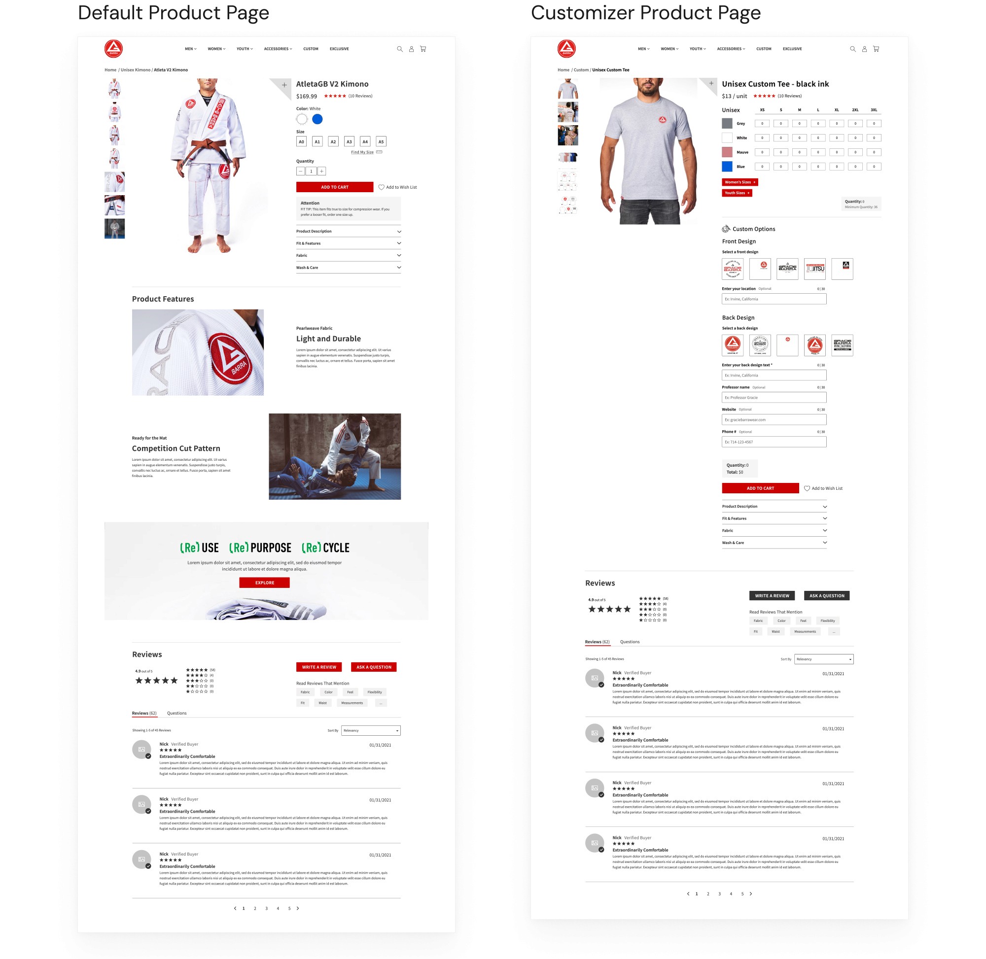
Re-imagine the user experience of the bulk order system, bringing it from analog spreadsheets to a custom PDP
UX Phase - Creating a Robust Custom Bulk Order PDP
About the Bulk Order System
In addition to offering uniforms and lifestyle apparel, GB Wear creates custom-designed products so teachers and students can represent their Gracie Barra school. Before the project, the client’s process of selling and fulfilling those orders was still completely analog. School owners would browse a catalog of custom designs, verbally place their orders over the phone, and fulfillment was tracked manually through long, complex spreadsheets.
The Goal
The client asked us to build out a custom digital solution that would make bulk order fulfillment easier for their team, printer, and customers.
Bulk Order Page Requirements
In addition to the wireframes created by my teammate, I lead the UX design process of the custom bulk order page
To kick off the design of the page, we first had to understand the requirements of the business, printing company, Shopify apps, and customers.
Bulk Order Page - Key Features
Size/Color Table
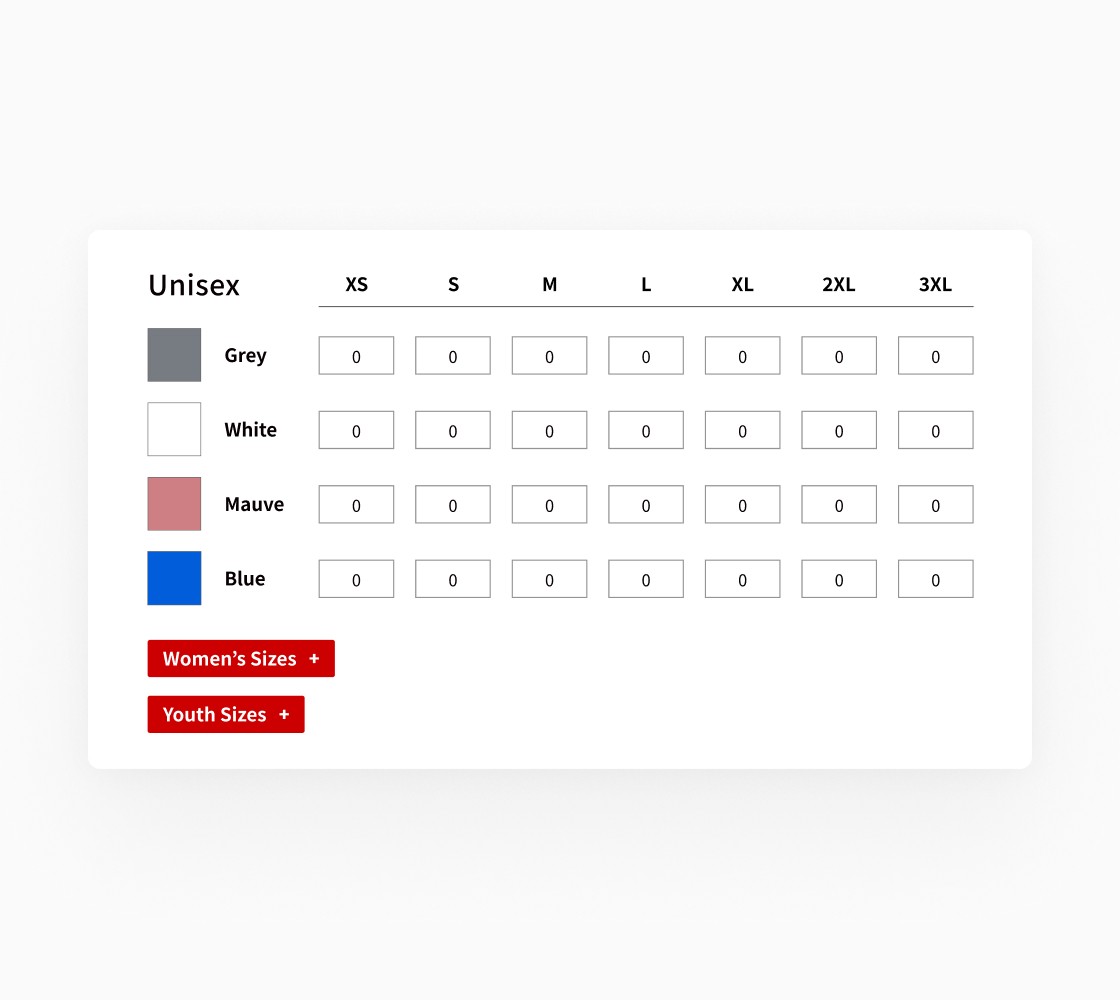
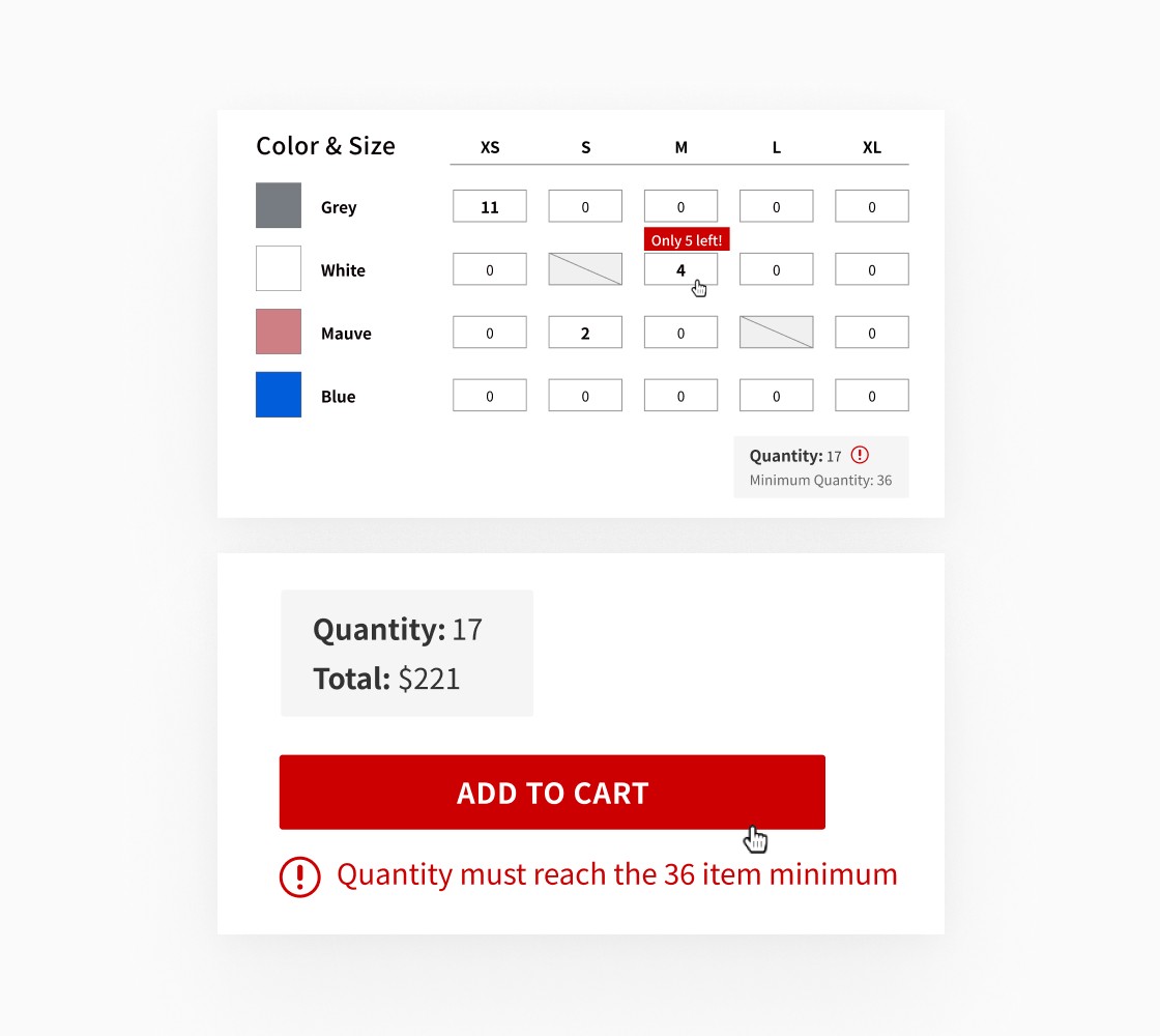
For visual clarity, the table is organized into columns of sizes, and rows of colors. Large color swatches are accompanied by the names of each color to account for color blindness. Because the unisex garment type is most commonly purchased, the “Women’s” and “Youth” size tables are truncated for more visual simplicity upon page load. To remind the user of the minimum item amount and help them more easily track their progress in meeting the minimum, a quantity tracker is located underneath the table.
Customization Flow
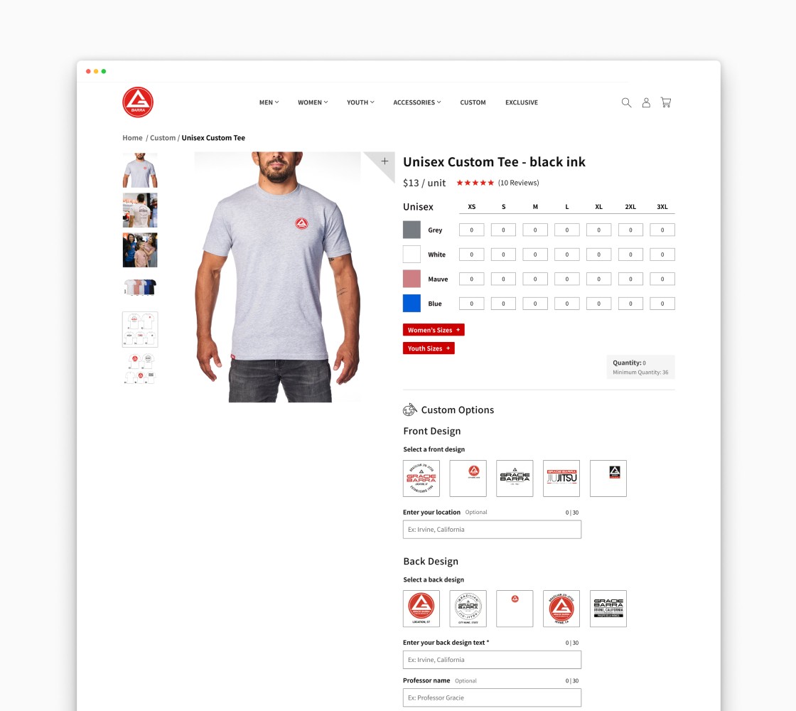
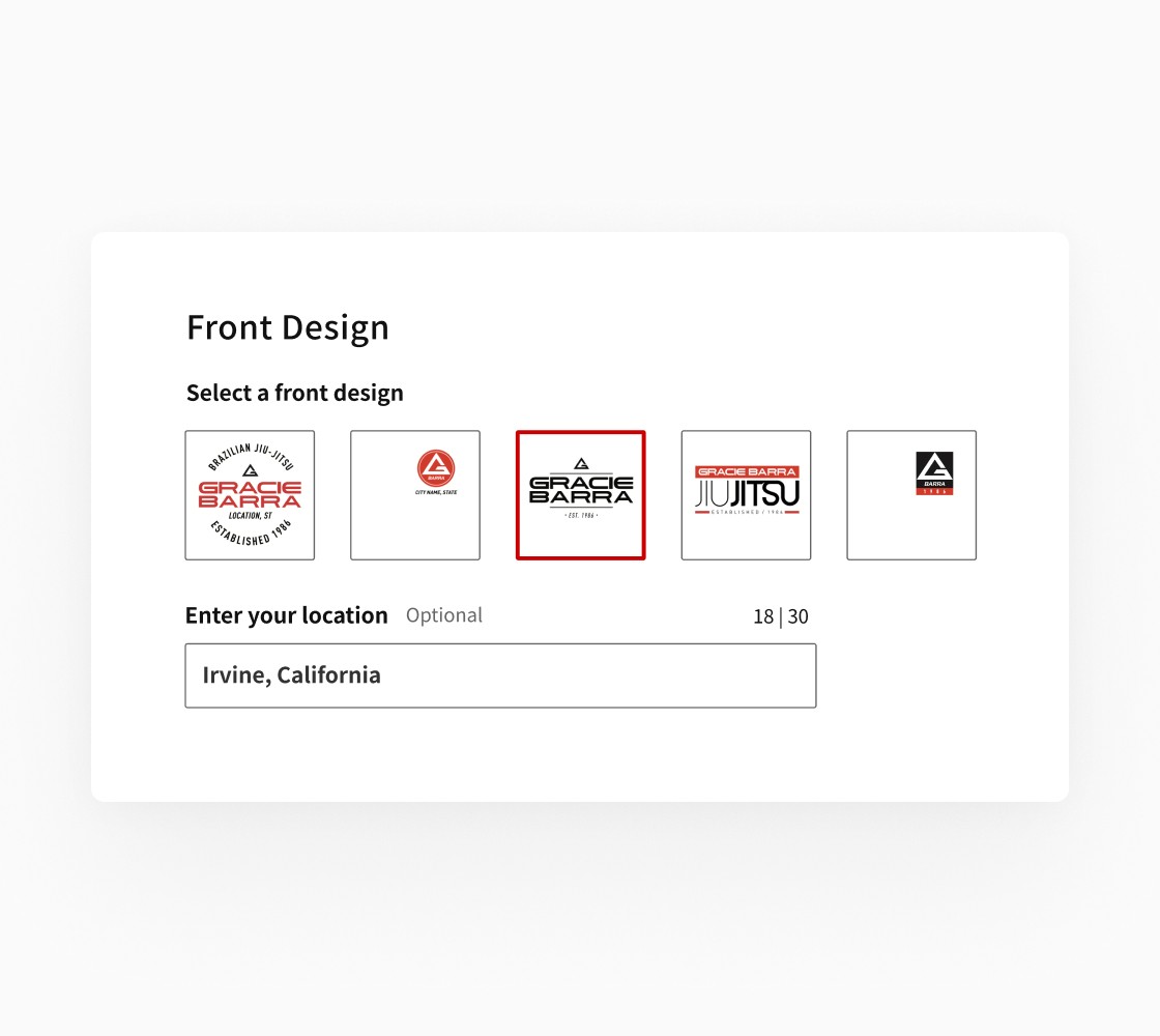
The customization flow is broken into two main steps - customizing the front and back of the design. Depending on what customizations are available for the selected design, inputs for all possible text customizations appear after the design is selected. Each input is styled with an external title as to not lose input context, a character count tracker, indicators of required or optional information, and an example of the text format needed inside the input for the user’s context.
Notifications & Progress Trackers
One of the biggest challenges was communicating the order requirements to the user in a way that didn’t add visual clutter to the page design. In order to keep the page simple, I worked with the client on prioritizing the most important, top-level information. For any edge case problems, I designed and wrote notifications to be displayed across all sections of the page to help guide the user toward understanding and meeting all order requirements. For example, notifications of low-stock size/color combinations, reminders of unmet minimum order amounts, and reminders of single-item orders that would need to be purchased or removed before placing a bulk order.
Visual Design

The Inspiration
To give the GB Wear site a fresh look, I first had to understand the key values of the Gracie Barra organization - brotherhood, integrity, and development. The best representation of these values comes from the students and teachers of Gracie Barra that live them out both in and out of the classroom. I felt that a combination of minimal, clear, and accessible UI would allow the images and videos of the students embodying those values to shine and shape the brand message.

